Binning Spatial Data For Better Graphical Representation on Maps

When it comes to data presentation, maps are the best! However, even maps can become confusing and hard to analyze if there there is data inaccuracy and imprecision. In fact, it also can affect many types of GIS analysis projects.
Data is everything. And it is present everywhere. The best thing about data is that it can give you insight into the intricate details if looked into properly. But data coming from multiple sources can be a big problem, especially for someone belonging to the telecom sector trying to analyze the network condition of a particular region or someone trying to predict if the habitat on a certain area on the landscape is going to get affected because of frequent soil erosion.
One of the primary features of GIS is the ability to collect information from multiple sources and stack it together in the form of layers before presenting on a single framework. It’s unique feature is the presenting spatial data on maps. This makes analysis easy. However, a collected dataset can contain several data symbologies and different points that often results in convoluted and inaccurate maps. In case of web maps it is a big problem as smaller scale maps need to depict more area and more data at different scales. Hence, in order to reduce the data congestion on maps, many GIS users and cartographers have turned to a process called Binning.
Making Data Interpretation Easier Through Binning
Binning is a pre-processing data modification method used for smoothing the data and reducing data noise. The advantage of data binning is that it helps to overcome the problem of data overlapping by reducing the number of data points presented on the map. As a result it allows important patterns to stand out.
Look at the map below showing taxi cab pick-up locations in Manhattan.

Just to let you know, the original dataset contained around 175 million records. For the sake of map representation, it was trimmed down to a mere million records. However, despite the data trim down, you can very well see how the data points overlap and the only thing that you can decipher from here is that there are a lot of taxis in Manhattan. However, this is not presenting the complete information. How do you know if all the taxis as seen on the map are available for pickup? How to find out which one is active and which one is not? What you need here is a variation in how the spatial data is being presented.
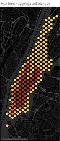
Now look at the map after the binning technique has been applied.

By aggregating the data into polygon regions, the problem of overlapping data has been eliminated and has made it easier to see the spatial variations. Now you have the complete picture.
How Binning Discretizes Spatial Data
Event-based logs are generated per unit of time and hence are Continuous data. Binning is data discretization technique that converts these continuous attribute into ordinal attribute — i.e. potentially infinite number of values are mapped into small number of categories. This is done as many data mining algorithms only accept categorical attributes.
In addition to Data Discretization, Binning is also about Concept Hierarchies, where the volume of data is reduced by collecting and replacing low level concepts by higher level concepts. Example — numeric values for attribute age are replaced by ranges such as Young, Middle-Aged, and Senior.
An Example of Data Smoothing Processing Using Median Binning Technique

When it comes to binning of spatial data, the location values are categorized into small number of groups associated with geographical areas or shapes. This assignment of a location to a group can be done by using coordinates of a data point to identify which bin it belongs to.
So when calculating the mean value of the sorted data, the location information of the data values also need to be taken into consideration. In other words, a binning input will consist of the sorted data values (the events) as well as the latitude and longitude of the sorted data values.
When the binning method is applied to the dataset, the latitude and the longitude coordinates are converted into Cartesian coordinates. These Cartesian coordinates will indicate where to plot the data point on the map.
Once done with the calculation part, the next step is the representation of the values on a binned map.
Data Presentation on a Binned Map
A binned map is nothing but the graphical representation of a certain geographic area that you want to study. There are many techniques available for graphically applying the binning method on the map. However, squares and hexagons are the most commonly used regular polygon bin shapes used for data representation on the map. Squares are useful if a given dataset contains a high number of close points. Hexbins on the other hand are useful for symbolizing meaningful patterns of data. The main difference between squarebins and hexbins will depend on how the shapes are calculated around the edges.
Some of the common reasons why Regular Polygon Bins or the Rectangular Binning is so popular are as follows —
> Aggregation of incident point data to regularly shaped grids can mitigate issues like arbitrary creation of irregular shaped polygons.
> Easy to tessellate — repeating the same shape over-and-over, edge-to-edge to cover areas without overlaps or gaps. The result is the creation of evenly spaced grids.
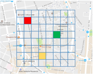
In order to apply the rectangular binning technique, a map needs to be divided into grids, where every grid is a representation of a certain geographical area from where the user wants to analyze the network behavior. It is the square grids that will work as the Y axis and the X axis and will help in tracing the latitude and the longitude for the exact location where a data point needs to be plotted.

The grids are customizable. The number of square grids required for the data representation as well as the size of the square of each grid can be defined by the user. For example, you will need a grid of 64 squares in order to analyze an area of 640000 if the desirable square size is 10000 (100 × 100).
Below is an example of how the map representation will appear.

Binning process will aggregate the data points located within the same square grid and this is where the statistical method of bin calculation is applied. The binning output or the binning process result will consist of the Cartesian X and Y coordinates and the aggregated bin value. Using the coordinates X and Y, the aggregated data value is then plotted on the map accordingly. Based on the bin size as defined by the user, the points are resized until the bins align nicely with no overlapping.

Creating Maps Using Binning
Creating maps using binning is easy. There are many open source plugin tools available like QuantamGIS and TileMill.
Infact, the QGIS community can offer you a number of plugins that can augment the existing features available in QGIS. One such plugin name is MMQGIS, created by Michael Minn. MMQGIS is a Python plugin consists of a set of vector tools, which you is not available natively in QGIS. You will need to install it separately to obtain the features. It does not matter whether you are importing a dataset with longitude and latitude in CSV format or reusing an existing shapefile (the file format generated by QGIS). The data files can be pulled in easily no matter which file format you use, and on which the grid layer can be created and data aggregation implemented. The grid layers can be configurable.
Once the binning process is complete, the shapefile exported from QGIS can be imported into TileMill for map creation. Using the TileMill, you can create your own Carto stylesheet and customize. The map created using TileMill are shareable anywhere online.
So if you want to share a map on a blog or embed one in your application or for in a report, you know which tools to use.